Wireframes
Low-Fidelity Designs
High-Fidelity Designs
Prototypying
Cross-Team Collaboration
Project Proposal
Wireframes Low-Fidelity Designs High-Fidelity Designs Prototypying Cross-Team Collaboration Project Proposal
Streamlining Product Development to Maximize Retainment & Improve the Customer Experience
An update and restructuring of BAM+ (suite of products within Abrigo’s platform) frontend, based on a shared component library that incorporates Vue.js 3, Element Plus, and (BAM+) design standards.
-
BAM+ allocated resources inefficiently across multiple UI libraries. These discrepancies hindered sustained growth, a cohesive user experience, and brand integrity. This resulted in high costs, longer onboarding times, and UI inconsistencies, which impacted user trust, satisfaction, and revenue.
-
Collaborated to define and implement BAM+ standards
Created design assets for the centralized component library
Conducted user experience evaluations to enhance navigation, search functionality, and UI consistency
-
Accelerate development and onboarding for BAM+
Standardize and maintained a centralized BAM+ UI library based on Element Plus and Vue.js 3
Improve BAM+ frontend using the centralized library and best practice guidelines
Establish resources for a dedicated cross-functional UI team
Enhance UI consistency and performance
-
Establish a cohesive and intuitive design system
Address 33% of enhancement requests related to navigation, search, and UI clarity
Designer and Developer Collaboration

Current UI Kit Templates

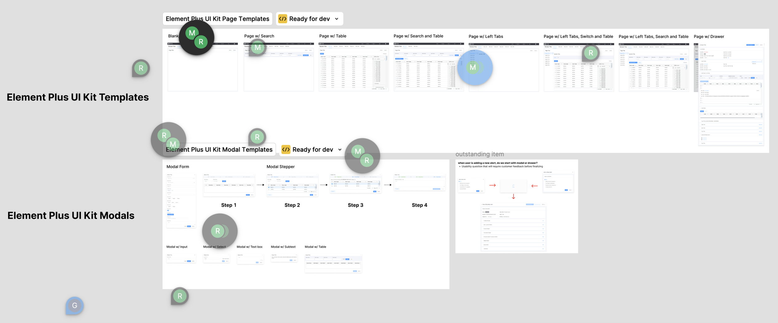
Proposed UI Kit Templates
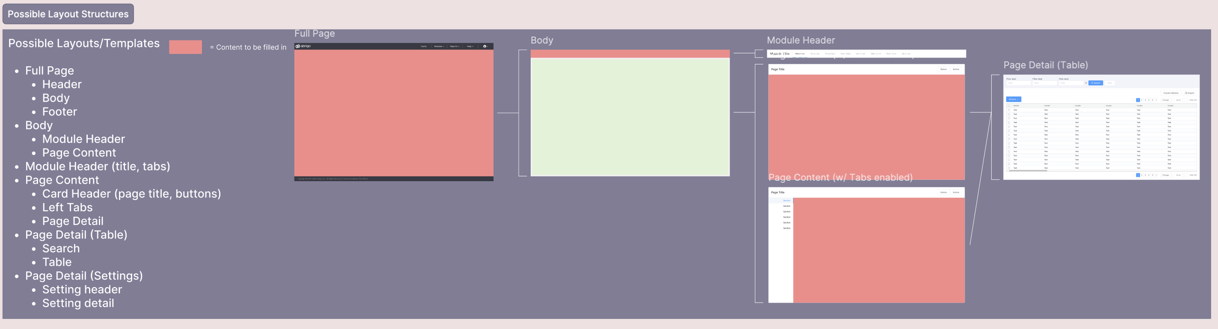
Possible Layout Structures

Current Product Flows

Templates & Content Designs
-
Audit Existing UI: Collaborated with the team to review current UI components for inefficiencies
Standardization: Helped define standards for the Element Plus-based library
Prototyping: Developed wireframes and prototypes to align with the Vue.js 3 migration
Feedback Loop: Engaged stakeholders (developers, sales, and customers) for iterative improvements
Documentation: Contributed to documentation for onboarding and training
-
Redesigned critical modules as part of the pilot rollout
Standardized design elements such as buttons, forms, and navigation components
Streamlined the design-to-development handoff using shared libraries.Redesigned critical modules as part of the pilot rollout
-
Resistance to Change: Some teammates expressed concerns about additional work resulting from the new workflows or tools
Technical Debt: Legacy code and dependencies complicated the migration process
Resource Constraints: Limited resources due to de-prioritization and competing priorities slowed the standardization process
-
Collaborate Between Teams: Establish a cross-functional and dedicated front-end team for alignment and efficiency
Dedicated Developer Resources: Developers to oversee the standardization process and implement library, shared focus on BAM+ UI and internal repositories
Centralized Component Library: Create and maintained a centralized component library ensuring all BAM+ products use the same version of UI components
Adopt Element Plus as Standard for BAM+ and fully transition to Element Plus for uniformity and ease of maintenance
-
Secured resource approval and stakeholder buy-in, leading to the hiring of 10 contractors to assist engineers in creation and implementation
Quantified and addressed UI-related client feedback and enhancement submissions from 2022–2024 with “quick UI fixes” or integration of fixes into the 2025–26 roadmaps
-
Incremental, user-centered design in large-scale projects was vital to user adoption. I set up feedback sessions with 30+ customers over a year to better understand frustrations and pain points. This was crucial when designing components and page templates
Adapting designs to work within the constraints of legacy systems was challenging. However, collaborating closely with developers on migration strategies allowed the designs to evolve incrementally without disrupting the existing user experience
Close collaboration with developers was essential to ensure design feasibility. By aligning designs with the Vue.js 3 and Element Plus frameworks, I streamlined implementation and minimized rework for future developers and designers
Designing scalable systems that accommodated future growth and modular updates was highly beneficial. By creating reusable components, I saved time and maintained UI consistency, addressing a significant issue BAM+ had faced
Regular involvement of stakeholders in the design process proved invaluable. I consistently held meetings to update stakeholders and gather feedback, which reduced resistance to change and ensured better buy-in from teams like sales and renewals
Aligning design decisions with both user experience and business outcomes was challenging. Not all desired UI fixes were implemented due to conflicts with business goals.However, presenting quantifiable data during discussions often helped bridge this gap