
CONTRACT PROJECT
TalentQL provides recruitment and outsourcing by connecting companies with top vetted technical talent.
MY ROLE
I worked as part of a team with another UX/UI designer. My primary focus was UI with support in UX, where my partners role was mainly UX with UI support.
As the UI lead, I led:
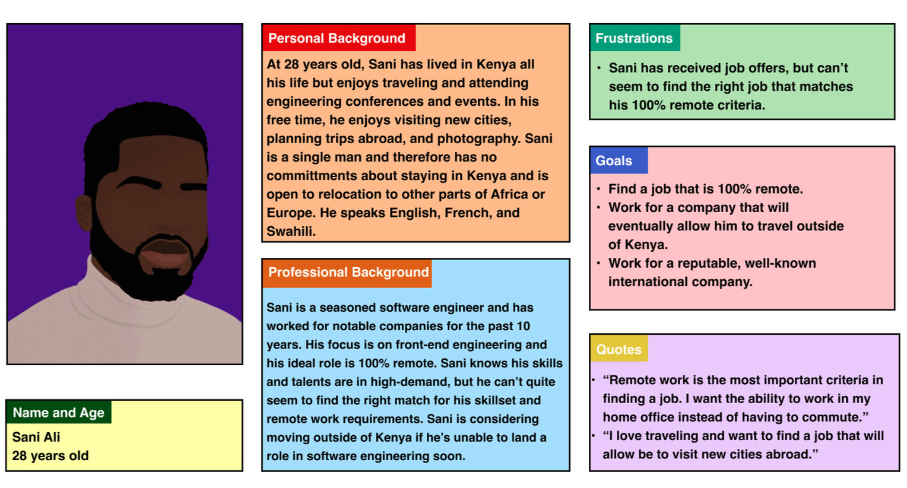
persona research & creation
wireframes
low-fidelity wireframes
As UX Support I aided:
user research
competitor analysis
journey maps & user flows
THE PROBLEM
Since TalentQL is still young and is in the early stages of development, the primary design challenge was building out a portal for both applicants and TalentQL administrators. Their largest user research challenge, was understanding how their site compared to competitors in the industry.


ADDITIONAL PROJECT DETAILS
The first part of the project was creating an efficient way for tech talents to apply online, create a profile, and submit their skills and background to TalentQL.
The second part of the project was creating an equally efficient and user-friendly way for TalentQL administrators to filter incoming applicants, have quick access to thousands of potential profiles, and match them to companies.
SECONDARY RESEARCH
Competitors Analyzed:
Toptal
Andela
Turing
High-Level Takeaways:
Name recognition where TalentQL is still new in the industry
Use of social proof and testimonials on websites lend site credibility
Clean imagery, easy application process that doesn’t feel tedious

WIREFRAMES FOR FORM PAGE
Once sketches, journey maps, and personas had been developed, I began creating wireframes in Figma.
The original application form was text heavy, lacked contrast, and was not visually engaging.
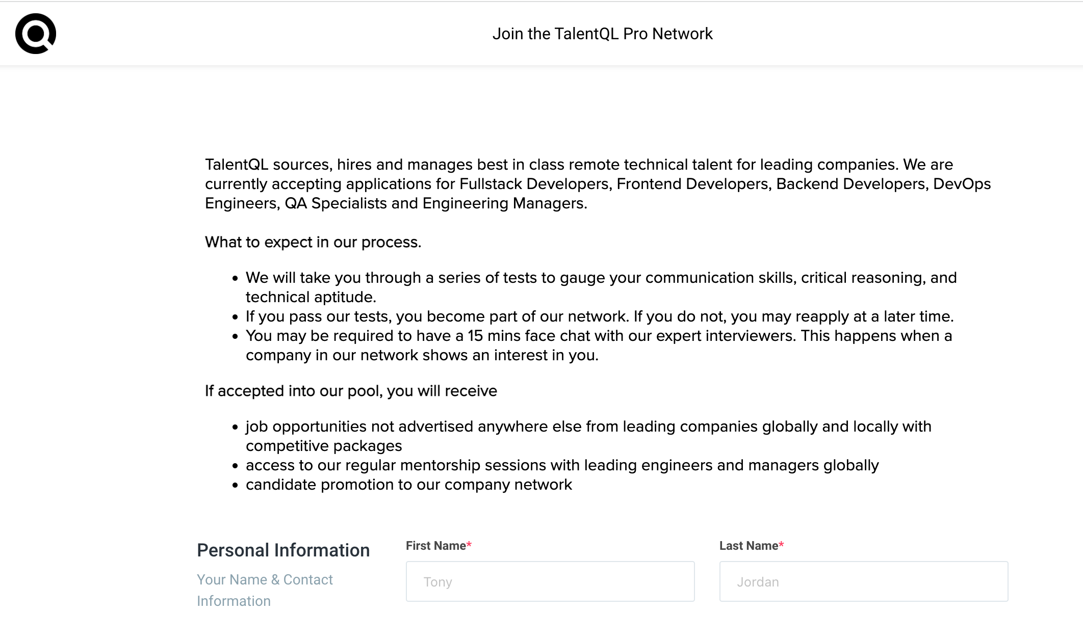
Original TalentQL Application Form Page
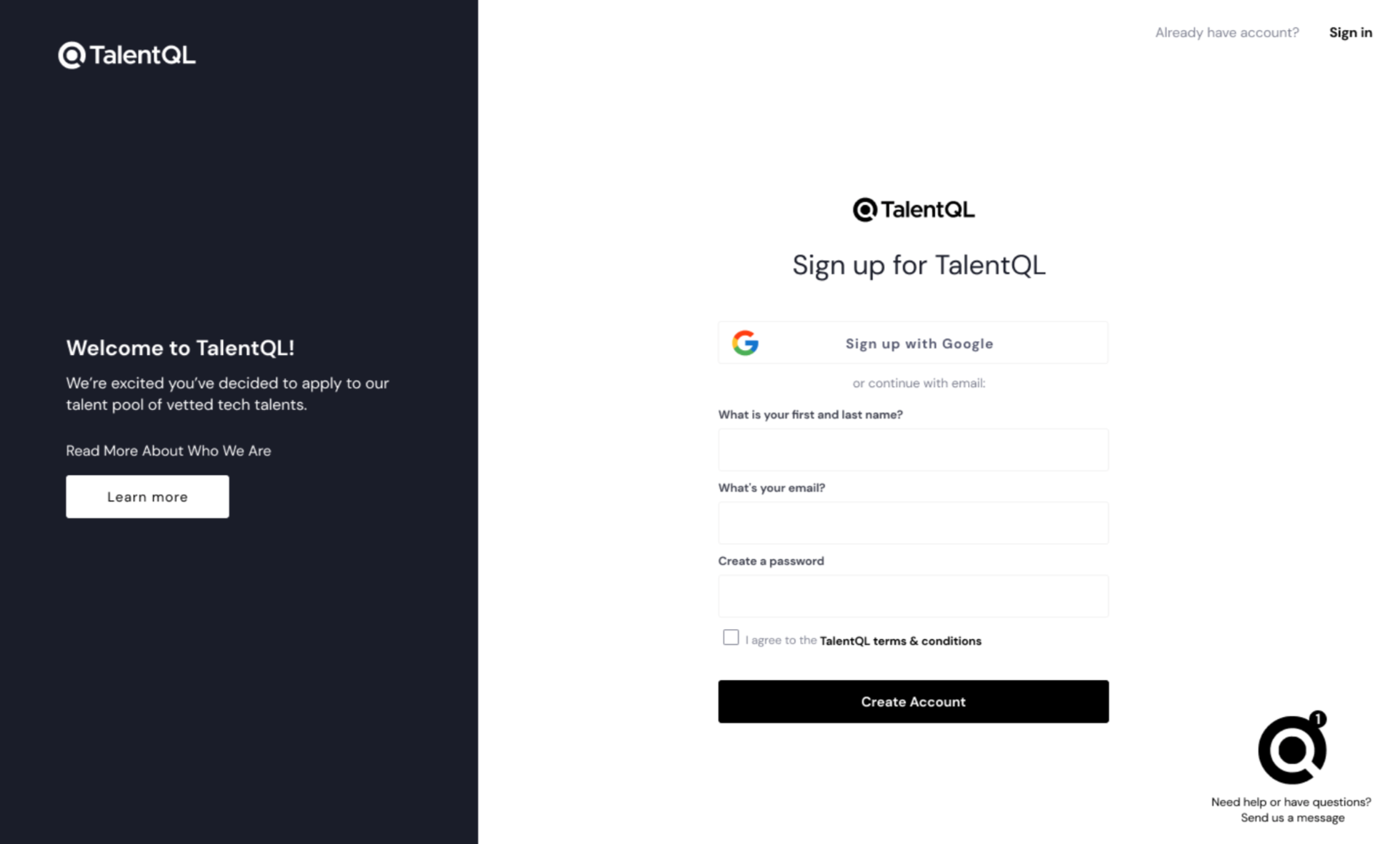
WIREFRAMES FOR USERS
The design I created broke up information in a more familiar way so users would immediately recognize how to sign up, and what to expect.
WIREFRAMES FOR ADMINISTRATORS
At the time of the wireframe build, TalentQL did not currently have a portal login for administrators.

RESULTS
Our UX/UI team was on a limited project timeline of 5 weeks, therefore we agreed to flesh out the research and wireframes as much as possible for TalentQL instead of going through the traditional route of research, wireframes, high-fi screens. Ultimately, our client was happy with the results and I felt like I had accomplished my job as a designer to think about the problem they were facing from several points of view.
PROJECT TAKEAWAYS
Listen To Your Client
As a designer, I wanted to be able to produce a functional product that not only worked well, but was seamless and fun to use. At times, it was difficult for me to focus on areas that needed the most functional development and instead, wanted to focus on parts of the design that were more exciting. It’s important to reel in what you want and be sure to focus on what the client wants. Sometimes they can be the same thing!
Cement Your Goals Early
This project was challenging with an incredible amount of moving parts. One helpful piece of the project that was initiated by my design partner, Gaby Perkes, was to create goals for the project on Day 1 (and stick to them if possible!). What was our overarching goal? How can we divide up smaller goals in order to accomplish the main goal?
Spend Your Time on Research
My design partner Gaby took on the majority of work on the research side of this project. When it became my turn to start designing, I found myself relying on her thorough research on competitors, challenges tech talents face, and the general state of the workforce marketplace in Africa. It was a strong reminder for me that good design isn’t possible without an even stronger base of UX research. Thanks Gaby!