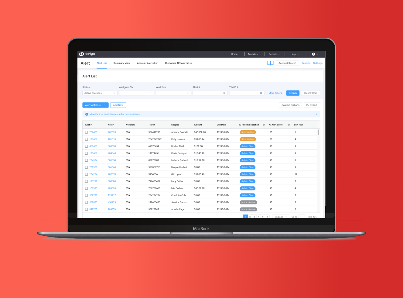
Project overview
Think of the notification your credit card company sends when a purchase looks unusual. Banks have similar systems that flag activity for employees to review. An alert is a warning to look more closely, not a final conclusion. This project explored how AI could summarize the information and suggest a next step while keeping the person responsible for the decision.
The problem: the work around the decision
Reviewers needed to understand what happened, decide what to do, and write down why. The hard part was often gathering context and documenting the decision. Information lived in multiple places, and writing explanations repeatedly was tiring and felt high stakes because someone might review those records later.
My role
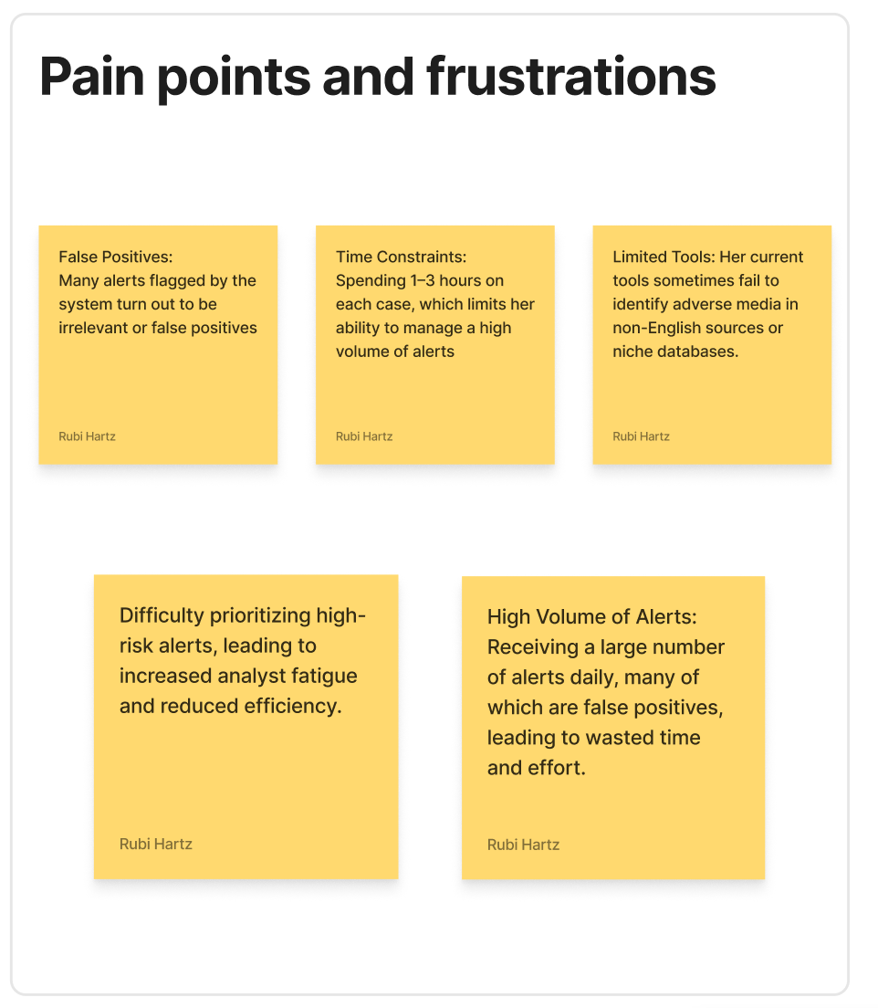
I led research and feedback conversations with analysts and managers, designed early concepts and detailed prototypes, and helped define how AI could responsibly support their work. The guiding principle was simple: reduce effort and improve clarity without removing human accountability.
Listening before designing
Research and follow-up validation involved eight analysts and managers across 16 remote, hour-long sessions. I asked people to walk through real work: how they reviewed an alert, what slowed them down, and how they felt about AI. I also looked at the wider banking industry to understand the practical limits of introducing new technology.
Three findings shaped the design
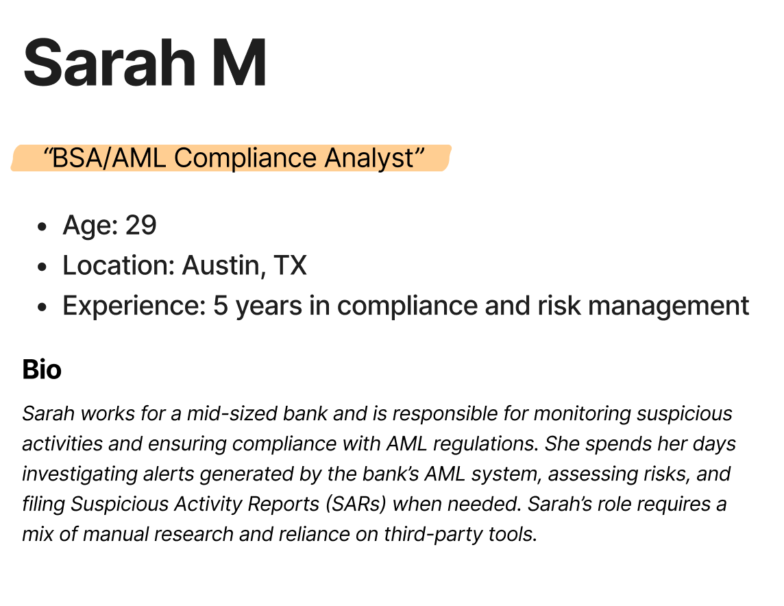
First, people wanted help gathering and summarizing information. Second, writing explanations often took more effort than choosing an action. Third, trust depended on understanding what the AI was doing and why. People welcomed assistance, but they needed to remain in control.
The proposed experience
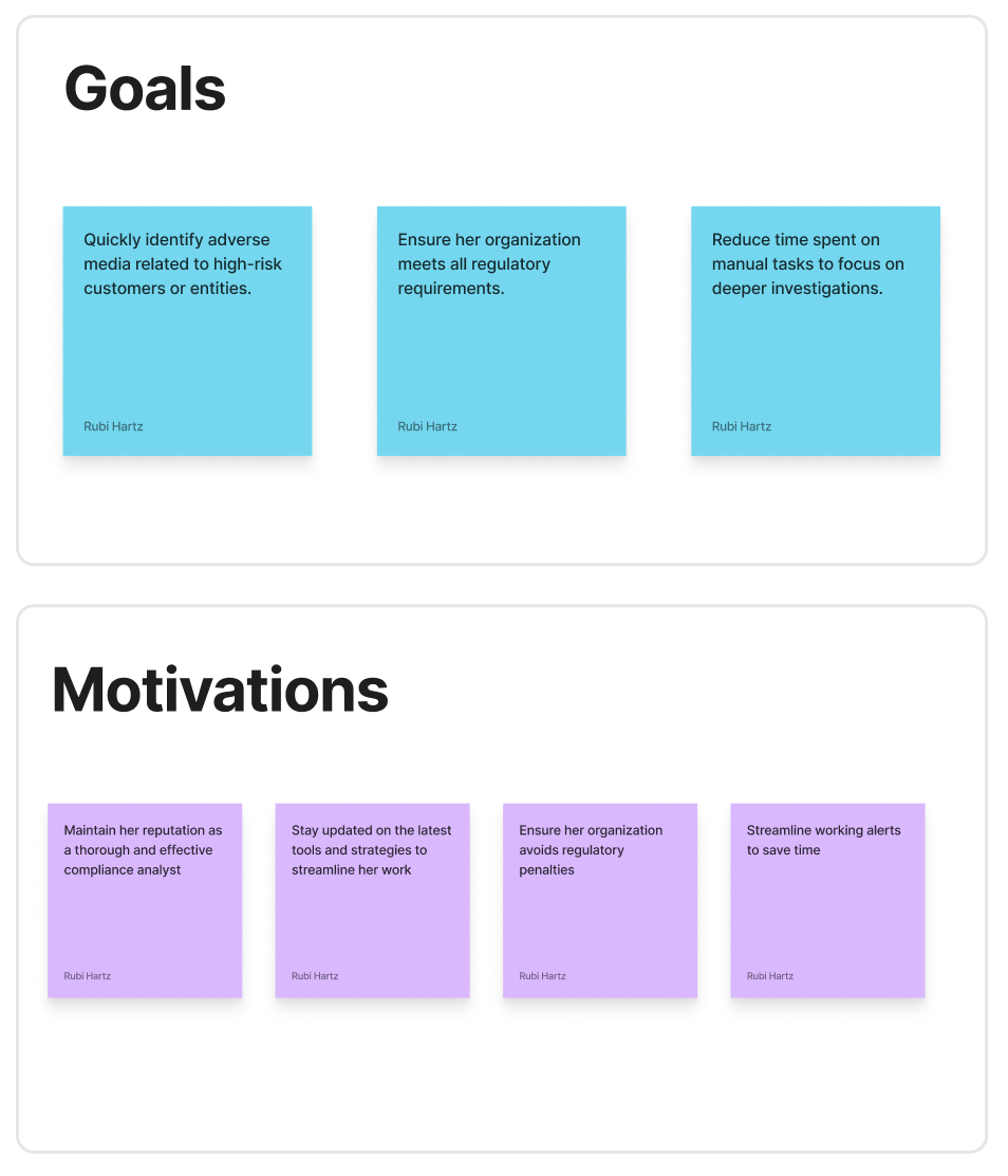
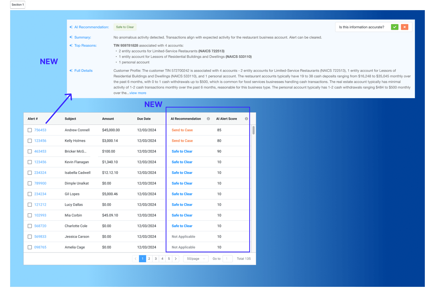
Automatic summaries explain what happened in plain language. Prioritization helps reviewers see which items may need attention first. Suggested next steps support the review rather than make a decision for the user. Together, these features aim to replace a manual search through scattered information with a clearer sequence of steps.
Testing whether suggestions felt trustworthy
I brought early designs back to the same users. We asked whether the recommendations were useful, whether scores helped prioritize work, and whether the generated explanation contained the information needed for their written record. Labels mattered: people were unsure whether “Safe to Clear” was a suggestion or an instruction.
Making AI easier to understand
Users asked for icons or badges that made AI information easier to notice, and ranges or labels that made scores easier to scan. Their feedback pointed toward stronger visual emphasis and clearer explanations of what a recommendation meant before opening the alert. The lesson was that useful AI also needs an understandable interface.
Outcome and reflection
The original case study describes an experience intended to reduce review effort and improve documentation, but does not provide a measured production improvement. The strongest design takeaway is the role of transparency: people need enough context to evaluate a suggestion, not simply accept it.