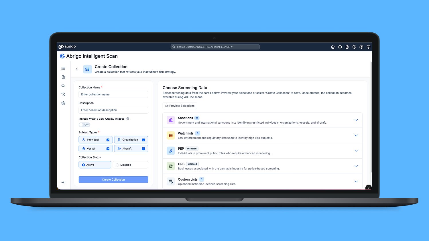
Project overview
Banks need to check whether a customer or payment may be connected to a risky person or organization. Software looks for possible matches and flags them for a person to review. A flag is a reason to investigate—not proof that someone has done anything wrong. Abrigo Intelligent Scan helps bank employees make sense of those possible matches.
The problem: too much searching
Reviewers had to move between tools and piece together scattered information. It was difficult to understand why a match appeared or whether it mattered. False positives—results that look concerning but turn out not to be a relevant match—added more work. People also relied on familiar features in the older tools, so a redesign had to preserve the parts that already worked.
My role
I planned and led research with analysts and compliance professionals—the people responsible for checking potential risk and following banking rules. I designed workflows, sketches, and detailed interactive prototypes. I also used Augment in VS Code to build interface components and work more closely with developers.
What I learned from people
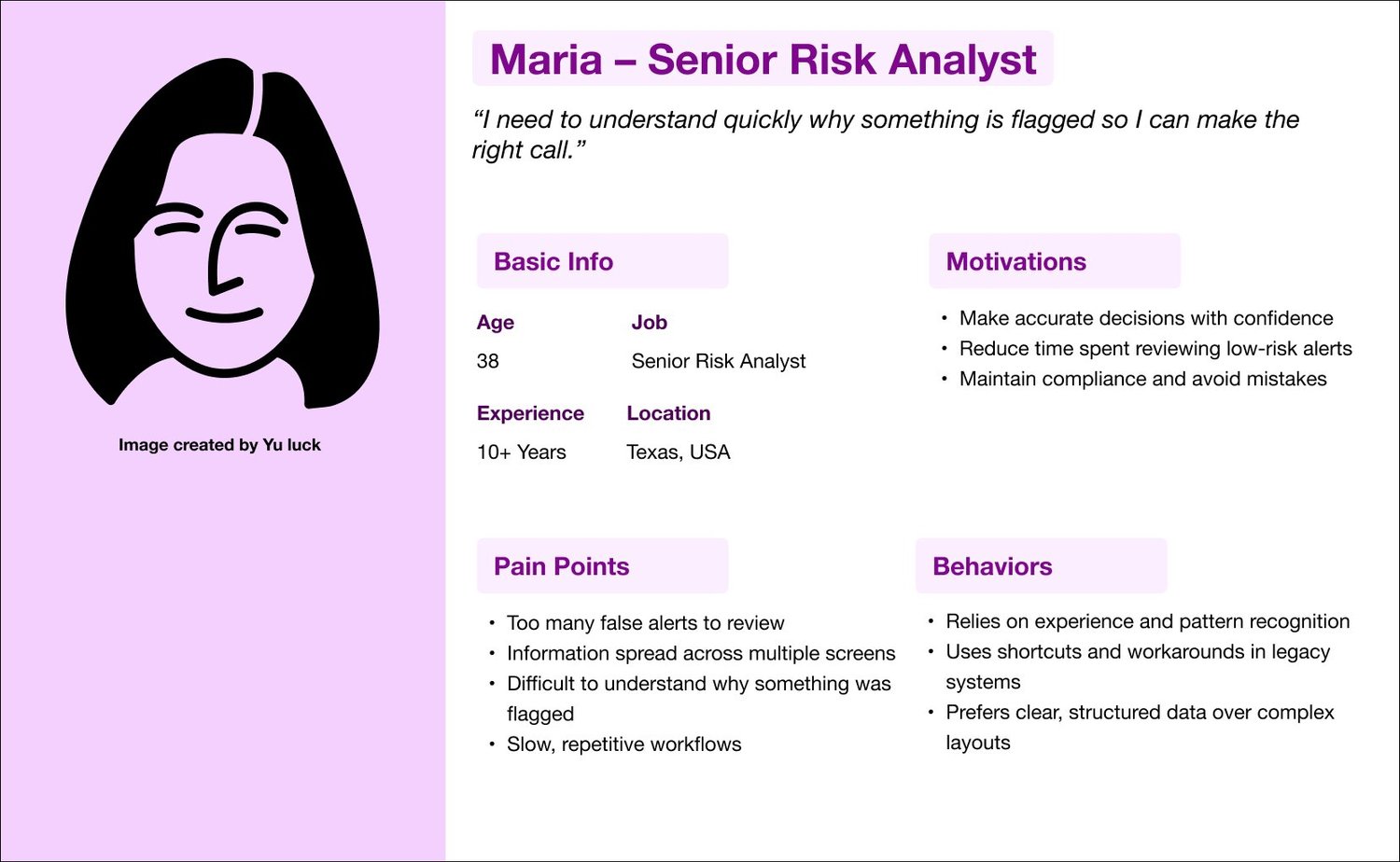
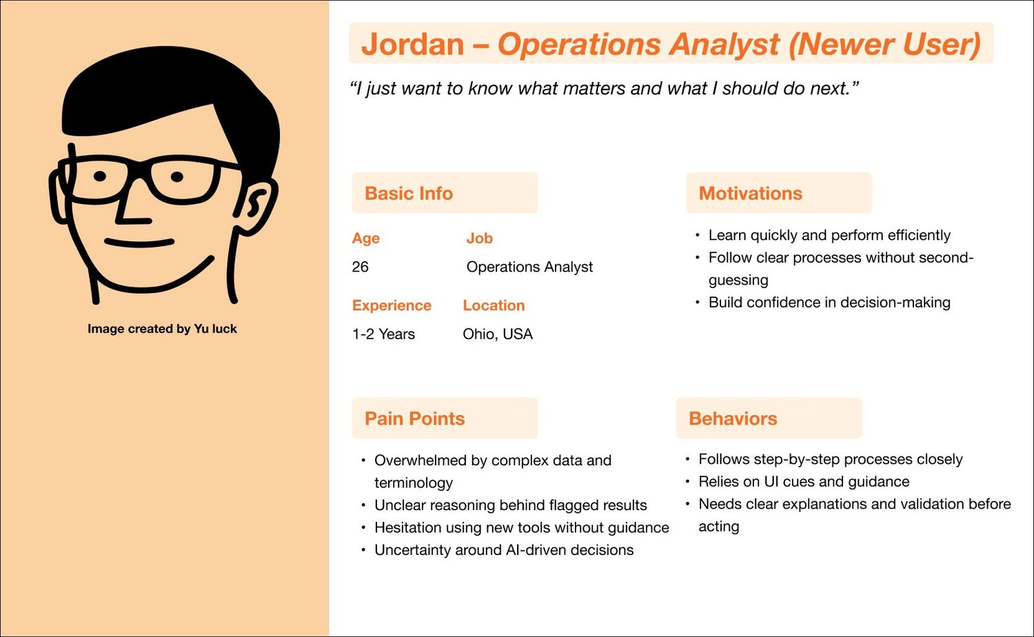
Over two weeks, I interviewed seven users with different roles and levels of experience. I asked how they reviewed flagged results, which information they trusted, and where their time went. Three themes stood out: information was scattered, the reason for a flag was unclear, and people were cautious about changing familiar tools or relying on AI.
Turning research into a clearer flow
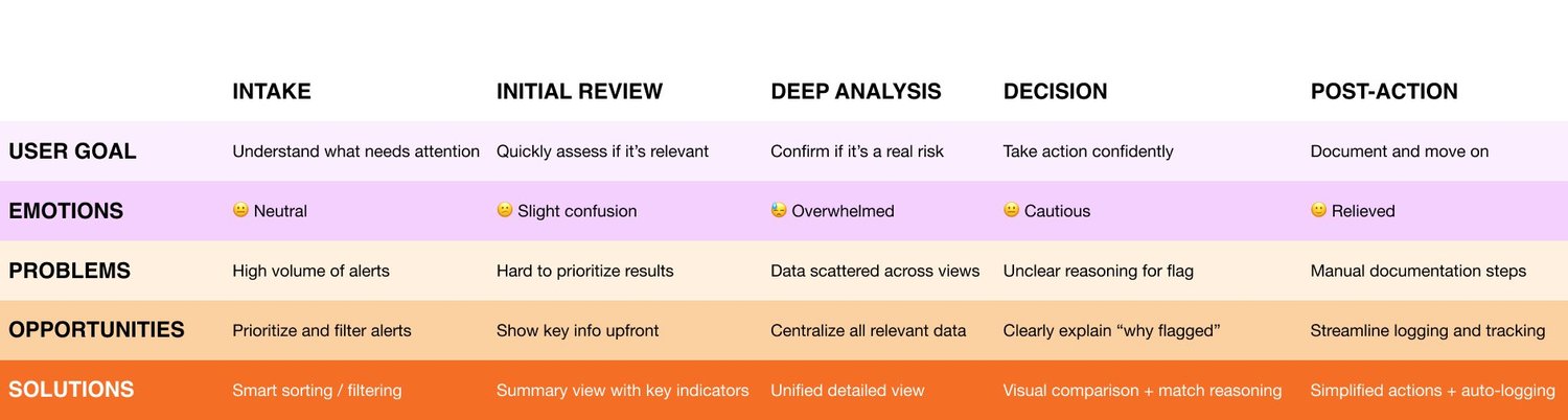
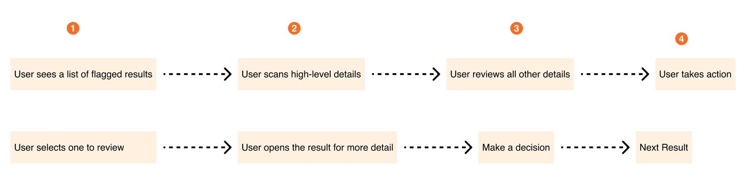
I used personas and journey maps to connect those findings to the steps in a real review: receive a result, examine the details, decide what it means, and take the next action. The opportunity was to bring the evidence together and make the reason for each flag visible. The goal was to help people spend their time judging the information instead of hunting for it.
Exploring the interface
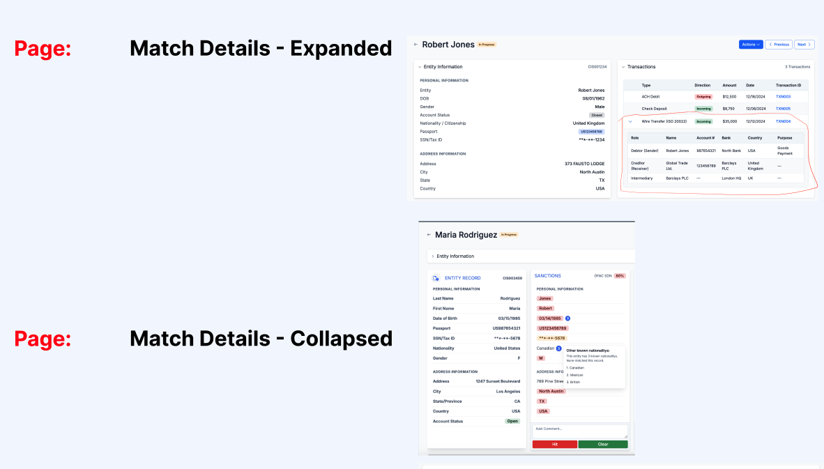
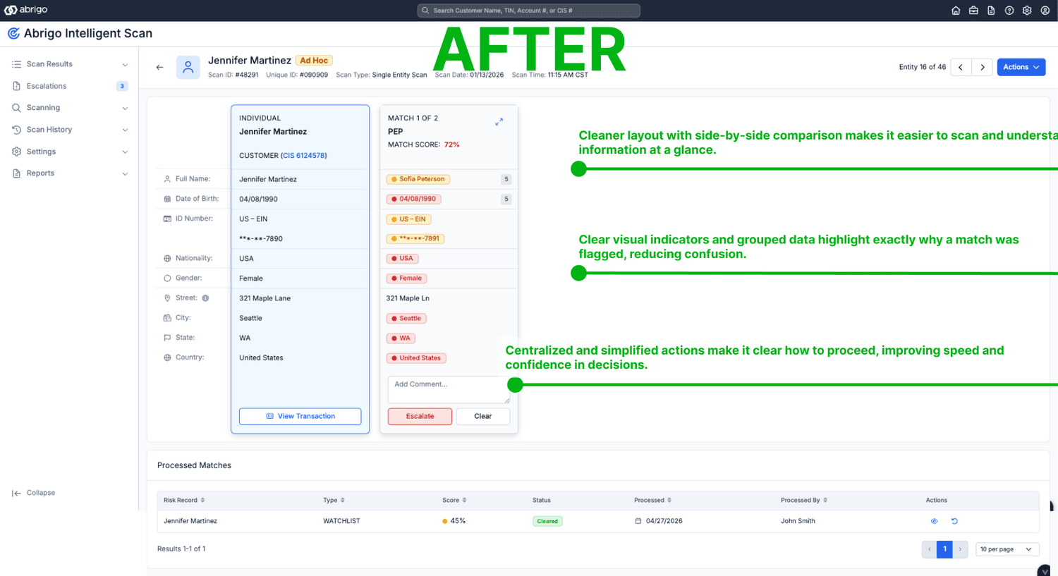
I sketched different ways to organize the information: one column or two, grouped or separated details, and different locations for the main actions. I moved forward with a side-by-side comparison so reviewers could compare the customer’s information with the possible match. Important details appeared first, with supporting information below.
Testing the explanation, not just the screen
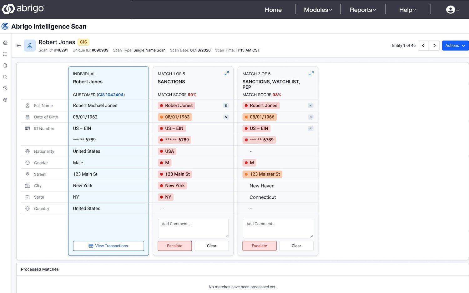
I created an interactive prototype in Figma and more realistic interactions using Augment and VS Code. Four initial usability tests revealed that people still hesitated when the interface did not explain why a result was flagged. I revised the design, then ran three more tests to check the improvements.
What changed
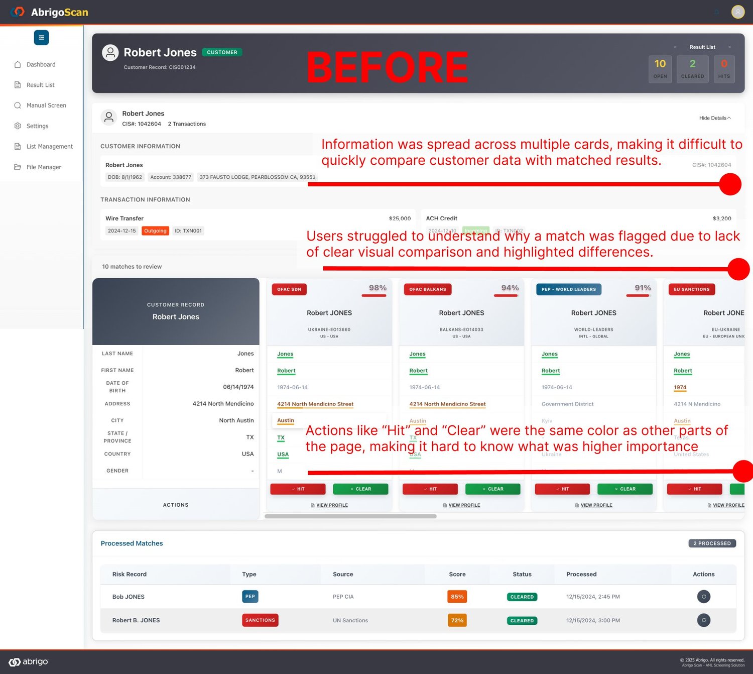
Before: information was spread across several cards, comparisons were difficult, and repeated action buttons made the next step less clear. After: a structured summary explains the flag, related details sit side by side, and clear visual cues show the match. Reviewers have one consistent place to clear a result or send it for further investigation.
What success means
20 customers have upgraded to Abrigo Intelligent Scan. We continue to collect customer feedback and iterate on the interface and user experience. The original goals were a 90–95% reduction in false positives and a 30–50% decrease in resolution time; these remain targets, not verified production results.
What I would carry forward
A simpler interface is only useful if people understand and trust it. Keeping familiar patterns helped reduce resistance to change; showing the evidence behind a flag supported confidence. Next steps included continued testing, clearer explanations of AI-supported results, better filtering, and guidance for people learning the new workflow.